Tuesday, May 13, 2008
Final Project Conclusion
For the past three to four weeks I have been working to finish my final project for visual concepts. Now that my project is complete, I am really happy with it. The first two weeks during class i spent riding the metro shooting different pictures of graffiti. Once I decided the graffiti pictures I wanted as well as the everyday pictures, I double exposed them together in the darkroom. I had six final photos in the end. The first one was of a pool table with graffiti on it, the second was a still life of boxing gloves with graffiti in it and on the walls. The third was of a female standing center in a kitchen with graffiti all around her, on the cabinets, floors, refrigerator etc.. The fourth one was of a toilet with a graffiti head on it, the fifth one was a bedroom with anti-war graffiti sandwiched on the walls. Finally, the sixth one was of a ski resort with graffiti sandwiched in the sky and mountains. All of the graffiti was then hand colored with different color sharpie markers making it stand out on the black and white image. With the pictures I purposefully exaggerated the contemporary view of graffiti in our culture. By placing it into random everyday surroundings I tried to show how graffiti art has changed over the years into a design element.
Final Project
For my conceptual piece I plan to purposely exaggerate the contemporary view of graffiti in our culture. Through out the 1060's and 70's graffiti was this illegal underground art, that people took risk to put up. This caused legislation to make graffiti illegal, having it removed when seen. Graffiti artist then became extremely territorial and competitive. In the early 1980's Die Hard Era, graffiti moved into the rap scene, starting it down the commercial track. As graffiti became more popular and new artist appeared it became more acceptable in the public eye. In the 1990's the clean train movement took place, removing graffiti from train cars, building etc. Graffiti artist then moved their street art into galleries, making it more commercial. Now Graffiti is a design element seen in music videos, t-shirts, wall hangings, video games, posters and more.
For my project I plan on taking pictures of both graffiti and everyday items and sandwich printing them together. In doing this I hope to show this purpose exaggeration. To incorporate color, I plan on hand coloring parts of the graffiti to further emphasize it.
For my project I plan on taking pictures of both graffiti and everyday items and sandwich printing them together. In doing this I hope to show this purpose exaggeration. To incorporate color, I plan on hand coloring parts of the graffiti to further emphasize it.
Color Photography
I have always loved B&W photography ever since junior year in high school. Before this school year I slowly started getting into digital more and more. It was at first hard to get an artistic shot out because I saw in black and white, and I thought every image I took with my digital camera looked so generic. I also was not a big fan of photoshop. After learning about how color works, which ones compliment each and how they blend has helped me out a lot.
When I am shooting color digital I try to pre-visualize the scene. I think about what colors are going to be in the composition and if they will work well with each other. I think what makes a good color image is one with a composition that has a scheme of color. For example, a landscape of a forest; to make this image good, the greens need to be vibrant with multiple shades of green.
This semester I learned a lot on photoshop, how to color correct images, balance, and correct contrast. I have learned to appreciate digital photography and what color can do to a photo.
Monday, May 12, 2008
COLOR
This entire semester in Visual Concepts we have been learning everything about color. From analogous, monochromatic, complementary, primary, and more, color has been the focus this semester. Learning about color and creating color has made me think color every time I look at something. When I look at peoples eyes I think oh that shirt really compliments them, like Niya who has green eyes, looks pretty great in a green shirt..I bet red would be hot! Which brings me to my next say on color. Color tells a lot about moods and emotions. Every color has an emotion associated to it. For example; black=death, red=love/fire/passion etc. I can't wait to start working with color film, that will change everything about a picture. GO COLOR! YOU ROCK!
Tuesday, April 8, 2008
Artificial coloring of Teas
I bought a box of blueberry tea bags in the grocery store the last time I was home and wanted to see how good it was. I boiled my water and placed the tea bag in my mug. Immediately the water turned a deep purplish blue. I thought that this was going to be a really strong tasting tea. I sipped it and it wasn't very strong at all, kind of disappointing really. I randomly talked to a friend of mine about it one night and he said that dye is put into teas. I started researching artificial coloring of teas and got a New York Times article. The title was The Artificial Coloring of Tea; What the Chinese Minister thinks the Practice Continued Simply to Supply the Demand written in 1878.
The article basically stated how the Delegation of New York and Baltimore merchants asked to extend the use of pure teas that the Chinese drink themselves to America. Doing this will stop the shipments of artificial coloring in teas. The minister replied as long as there is a market they cant stop, due to expenses to furnish the teas. The minister stated he is more than willing to stop artificial coloring. Unfortunately, "The remedy rested wholly with consumers not the producers."
That was a surprising article to read. I wonder if today teas are still being produced with artificial coloring. If so, how many different tea brands coming from China have artificial coloring it them, and if the ingredients has to list it.
Monday, March 10, 2008
Jelly Bellys
 People tend to associate food with color. Everything we buy and eat has a distinguished color, shape, and form to it. As we grow we learn to match colors to certain foods allowing us to tell what it is. For example, we know the fruit with a deep purple blue color is a plum, a banana is yellow, and a watermelon is green and red-pink. Some food items like candy, have the flavoring of foods without looking like the food itself. There for they distinguish the flavor through color.
Jelly belly's are the perfect example of using color to detect flavor. Jelly belly's have fifty different flavors and fifty different colors. Each color of the jelly bean follows the generic color of the food. For instance, popcorn is white with yellow for the butter, the bean is white with yellow speckles.
Monday, March 3, 2008
Color Eye Contacts
Eye contacts, they started as another alternative to the eye glasses. Then wahlah, the color eye contact was invented.

Color contacts are wild looking. I remember the first time I saw color contacts but didn't know they existed yet. I was in third grade and my friend invited me to Dave and Busters. At the end of a fun night I was going to cash in my tokens for a prize. The guy behind the cunter turned around and had solid black eyes, i was so taken back by it.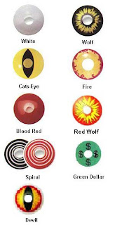
It is seems so extraordinary to me when I see people wearing color contacts. Its allmost like dressing your eye for an occasion, or mood, or simply because the color is appealing. Wearing colors is a personal style for people to express themselves beyond just clothing. People show this by dying their hair, or painting their car or room their favorite color, or getting colored tattoos, or contacts etc. This goes to show that color is such a representative subject. I think that extreme color contacts are crazy, and people have to be bold to wear them. I wonder, do people think..I want cat eyes today, or I want to invision patriotism....

Color contacts are wild looking. I remember the first time I saw color contacts but didn't know they existed yet. I was in third grade and my friend invited me to Dave and Busters. At the end of a fun night I was going to cash in my tokens for a prize. The guy behind the cunter turned around and had solid black eyes, i was so taken back by it.

It is seems so extraordinary to me when I see people wearing color contacts. Its allmost like dressing your eye for an occasion, or mood, or simply because the color is appealing. Wearing colors is a personal style for people to express themselves beyond just clothing. People show this by dying their hair, or painting their car or room their favorite color, or getting colored tattoos, or contacts etc. This goes to show that color is such a representative subject. I think that extreme color contacts are crazy, and people have to be bold to wear them. I wonder, do people think..I want cat eyes today, or I want to invision patriotism....

Colors of a Wedding Dress
In America everything I see and know about a bride and her dress is the color white. Pictures, magazines, and bridal shops throughout America markets white dresses because its the traditional and most popular color choice. The relatively modern meaning of the white wedding dress in America symbolizes virginity and purity. This symbol has not always been around. In 1840 Queen Elizabeth popularized the white dress when she married Albert of Saxe and slowly it became the color of choice, especially when seen in American films.
Other countries in the world dress their brides in different colors each with different symbolism. In Africa brides chose colors and pattern's to their tribes custom. Jewish brides often wear white, which represents spiritual purity and clarity. In China brides wear the color red representing luck and boldness. In Japan brides wear white silk kimono lined in red representing happiness and a new beginning. In India brides wear silk sari made using the color of choice, red, green, gold, yellow, and white.
All over the world the color of a brides wedding dress has a symbolic meaning associated with the culture or just the women herself. I found this old American poem about brides dresses influencing her future. It folows; “Married in white, you will have chosen all right. Married in grey , you will go far away. Married in black, you will wish yourself back. Married in red, you’ll wish yourself dead. Married in blue, you will always be true. Married in pearl, you’ll live in a whirl. Married in green, ashamed to be seen, Married in yellow, ashamed of the fellow. Married in brown, you’ll live out of town. Married in pink, your spirits will sink.”
Tuesday, February 12, 2008
The Wonderful World of Color
When ever I think of colors two pop into my head; orange and red. I would say orange is my favorite color and red catches my attention and works great with orange. To think that colors can control so much emotion on a subject and influences the way people think is amazing. Everyone associates color with emotion. When i think of the colors orange and red I think of intensity. Not in a bad way by any means but personally eye catching. For example, a beautiful sunset, my Jimi Hendrix poster, a bright red jacket etc. I think orange and red are bold and radiant, maybe that is what attracts me to them.
What makes color even more interesting is how each person gets similar feelings but maybe to a different color. I think what makes people like a certain color or dislike a certain color is because a color might mean something to one person and the opposite to the next. Almost like people see the same color but differently. I asked one person what their favorite color was and she said blue then I asked someone else and they said their favorite color was blue also. My next question was why do each of them like that color. One person told me because it reminds them of the ocean and they just like how it does that. The other person said she likes the weird shades of blue and its calming. The same color gave them different emotions.
In conclusion, colors leave such an impact on how people feel and what brings each person to their peace. I think that everyone sees the same shade in colors but it has a different affect on each person. That is why a persons favorite color is an important aspect to what surrounds them. It controls what they think is beautiful an d that is amazing.
What makes color even more interesting is how each person gets similar feelings but maybe to a different color. I think what makes people like a certain color or dislike a certain color is because a color might mean something to one person and the opposite to the next. Almost like people see the same color but differently. I asked one person what their favorite color was and she said blue then I asked someone else and they said their favorite color was blue also. My next question was why do each of them like that color. One person told me because it reminds them of the ocean and they just like how it does that. The other person said she likes the weird shades of blue and its calming. The same color gave them different emotions.
In conclusion, colors leave such an impact on how people feel and what brings each person to their peace. I think that everyone sees the same shade in colors but it has a different affect on each person. That is why a persons favorite color is an important aspect to what surrounds them. It controls what they think is beautiful an
 d that is amazing.
Tuesday, January 29, 2008
Social Implications of Color


In the society we live in colors are used as a connector to human brains and their atmosphere surrounding them. People were taught early in childhood to associate colors to common things in life. Colors are a way to visually represent moods or feelings, temperatures, and are used as adjectives to describe things. When the color blue is shown people relate it to the sky, ocean, a clam state etc. The color yellow is associated with the sun, illumination, a state of happiness etc. Red is associated with blood, stop lights, anger etc. Green is associated with the earth, grass, vegetation, life etc. Orange is related to fire, sunsets, Halloween etc. Black is related to death while white is related to purity.
Our class project was to take pictures of objects whose colors match the object and ones who oppose their object. One picture my group took was a green fire hydrant . I thought this objects color did not match the object itself. When I think of fire hydrants I think of the color red. Red shows urgency, chaos which is what goes on during a fire, but green is a natural earthly color. I think this color opposes the object it is on.
The next picture our group took was a picture of a row house. The color of the bricks are a light tan and the color on the window flaps are a reddish brown. These two colors work really well on the row house. The tan and brown are both neutral colors so they don't conflict with eachother. The colors together give the house a warm soft feeling to it, I think the color choice was nice.
Subscribe to:
Posts (Atom)